


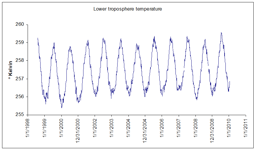
The most obvious thing about this record is its seasonal nature. It's colder in the (northern hemisphere) winter, and hotter in the (northern hemisphere) summer.
But (I hear you cry) since it's a global dataset, when it's winter up here, it's summer down there. So shouldn't that cancel out?
Well, no. Water has a lot of thermal inertia: it takes a long time to heat up, and a long time to cool down. Land responds much faster to heating and cooling. And there's a lot more land in the northern hemispere, so even a global dataset will follow the northern hemisphere seasons. And that's annoying, because the seasonal "noise" swamps the more interesting long-term signal that we're looking for. So what we really want to do is to remove the seasonal component entirely.
Here's how we do that. We start by averaging the satellite temperature for each day of the year. We have a little more than 12 years worth of data, so we average all of the January 1 data (regardless of year), all the January 2 data, and so on. (I removed February 29 from the dataset, because there are only 3 of them, which is really not enough for statistics). When we do that, we get this really nice seasonal curve:
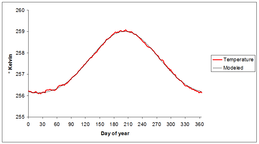
The red line is the average temperature for each day of the year. It's almost a sine wave, but it also has a sine-squared component. The thin black line is a mathematical model of the red line. For you math geeks, it's given by the following equation:
Temp = a1 * sin((day + phase) / L) + a2 * sin²((day + phase)/L) + offset
... where phase is -111.5187 days, L (inverse frequency) is 58.09 (or 365/2π), offset is 257.269, a1 (amplitude of the sine component) is 1.4401, and a2 (amplitude of the sine squared component) is .3024 .
As you can see, the black line replicates the seasonal variation very exactly. So now, we can subtract the "expected" temperature on a given day (computed from our equation) from the actual measured temperature, and we will have a nice view of global temperatures with the big seasonal wave removed. It looks like this:
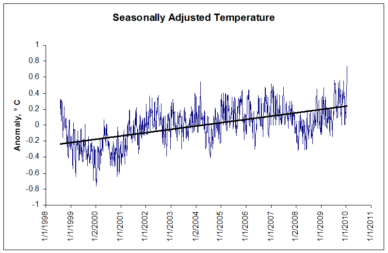
A few things to notice here. First, the blue line (seasonally-adjusted temperature) starts on a downward trend in 1998 and 1999. That's because 1998 was (at the time) the hottest year on record globally, propelled by a massive El Niño. So yes, '99 was a definitely cooler than '98. Notice also how generally warm 2005 was (almost entirely above the black trend line); no surprise, '05 was either the first or second hottest year on record, essentially tied with 1998.
Now look at the rightmost end of the graph. That's where we were on Saturday, January 16, 2010. After adjusting for normal seasonal effects, it's the hottest day globally in the history of recorded temperature measurement, according to the UAH daily dataset. Prior to this week, the record had been held by March 9, 2004, an anomaly of .54 degrees (compared to the 1998-2010 average). That record was nearly matched on July 19, 2009. But the record was decisively broken twice several times during mid January, most decisively on Saturday, January 16, when it reached .75 degrees.
Another disturbing trend: the black line, which is the regression line for the series, has a slope indicating an increase of over 4°C per century. And thereby hangs a tale: because, as we shall see, that's a trend far above the standard UAH global dataset. Which means there's something interesting going on.
If I were a denier of the Anthony Watts or Joseph D'Aleo class, I would cry "Conspiracy!" at this point. But the truth is almost certainly far more benign, as we shall see.
No comments:
Post a Comment